
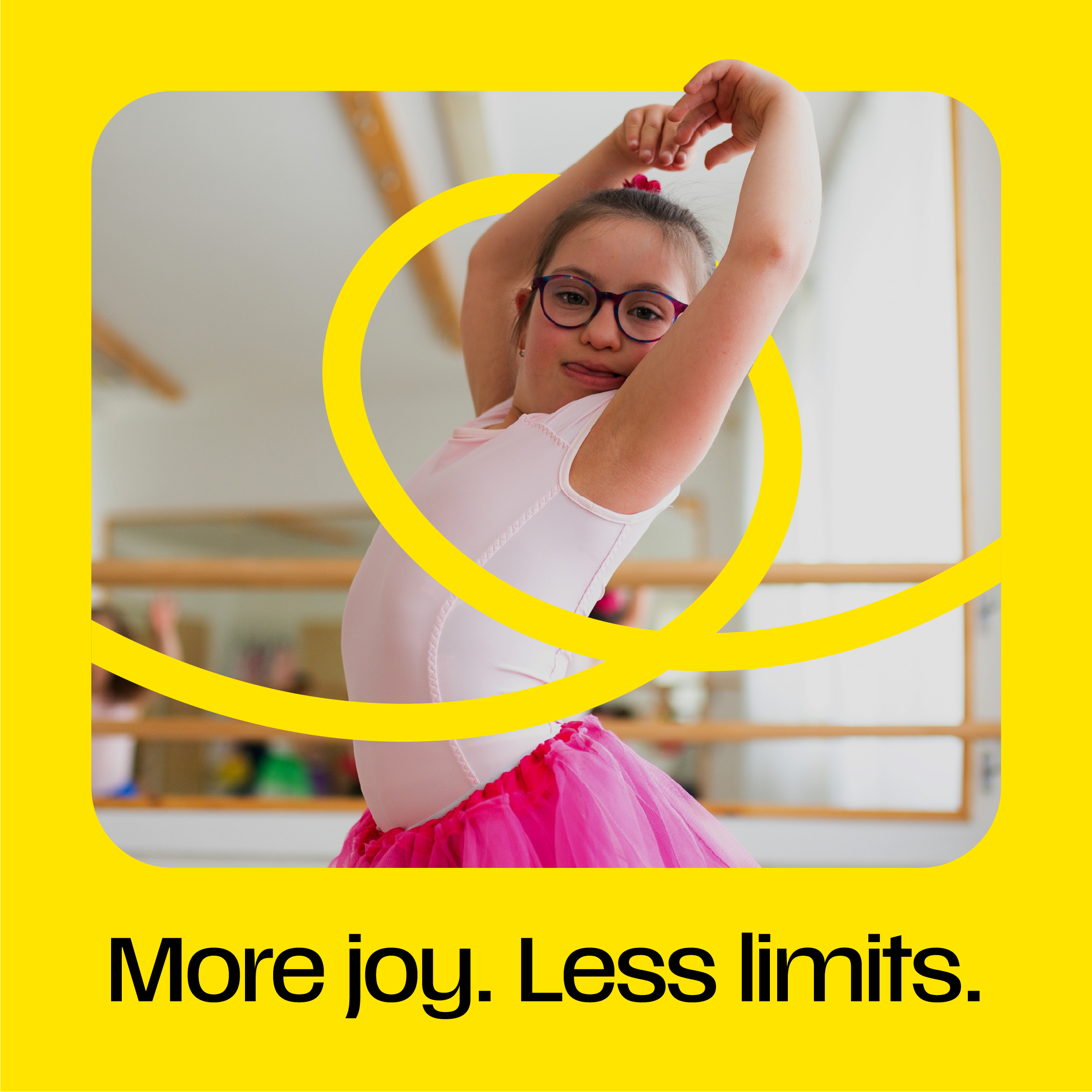
Life Without Limits
Most care brands talk about support. Tao talks about possibility.
From the very beginning, we recognised that the organisation wasn’t simply helping people access care services; it was helping people build lives filled with independence, confidence and opportunity. That belief became the foundation of the entire brand strategy and ultimately inspired the positioning: Life Without Limits.
More than a strapline, Life Without Limits captures a powerful truth about Tao. Everyone deserves the chance to live life their way, to pursue ambitions, embrace opportunities and shape their own future. The brand needed to reflect that optimism and ensure every interaction, message and experience reinforced what was possible, not what was preventing progress.
Seeing People, Not Categories
The care sector often defines people by the support they need. Tao sees something different.
Through strategic workshops, stakeholder engagement and brand development, we uncovered an organisation driven by a belief in individual potential. Rather than focusing on labels, needs or limitations, Tao focuses on aspirations, choices and outcomes that genuinely improve lives.
This shift transformed the way the brand communicates. The conversation moved away from services and towards people. Away from dependency and towards empowerment. Every aspect of the strategy was designed to ensure those supported by Tao remained at the heart of the story.
Changing the Conversation
One of the greatest opportunities was to create a new language for the sector. Care communications are often dominated by jargon, policy language and institutional terminology. While familiar within the industry, this language can feel distant and impersonal. Tao needed a voice that reflected the warmth, humanity and positivity that already existed within the organisation.
We developed a tone of voice that is encouraging, straightforward and optimistic. It celebrates achievements, focuses on possibilities and speaks to people as people. The result is a brand voice that feels genuinely human and immediately distinctive within a market where many organisations still sound the same.
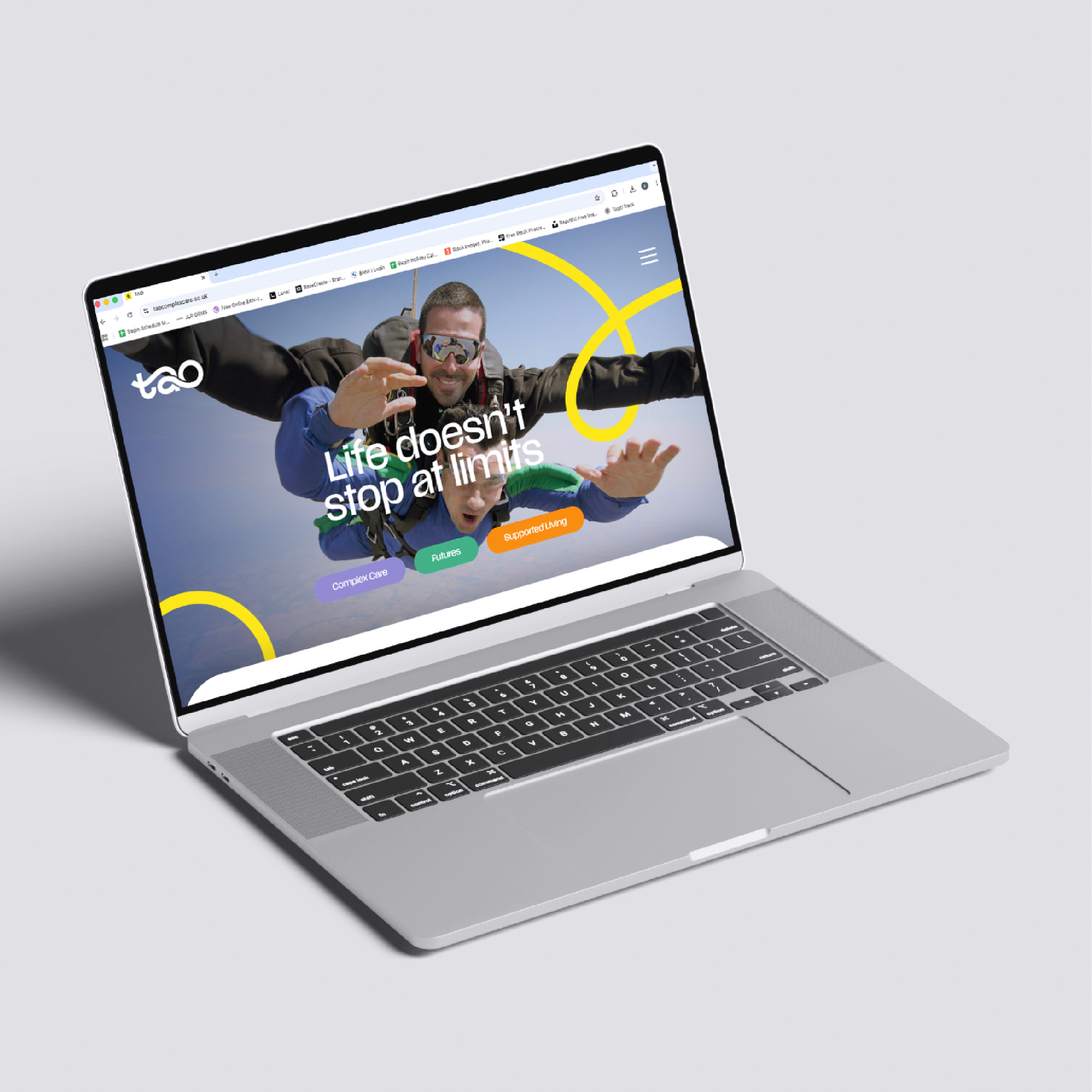
A Brand That Looks Forward
The strategy demanded a creative identity that felt as progressive as the thinking behind it.
Many organisations within the sector rely on familiar visual cues that communicate safety and reassurance. Tao needed to retain trust while creating something more inspiring; a brand that reflects ambition, individuality and the positive impact support can have on someone’s life.
The creative evolution introduced a more contemporary and energetic visual language, helping Tao stand apart from category conventions. The result is a brand that feels confident, welcoming and full of possibility, reflecting the experiences, achievements and aspirations of the people it supports every day.
Building Momentum For Growth
Great brands do more than communicate; they create belief.
The new Tao brand provides a platform that supports recruitment, engagement, marketing and future growth. It helps attract people who share the organisation’s values, strengthens connections with families and commissioners, and creates consistency across every touchpoint.
Most importantly, it gives the organisation a clear and compelling story to tell. A story built around opportunity, independence and the belief that everyone deserves the chance to live a life without limits.
Leading A New Era Of Care
The most successful brands don’t follow the category. They redefine it. Today, Tao occupies a distinctive position within the sector. While many organisations continue to focus on care provision, Tao champions potential. While others communicate support, Tao celebrates achievement. While others focus on limitations, Tao focuses on what comes next.
The result is a brand that feels different because it is different. A brand built around optimism, shaped by purpose and designed to inspire people to see a future full of possibility. A brand that truly brings Life Without Limits to life.


 Work
Work Contact