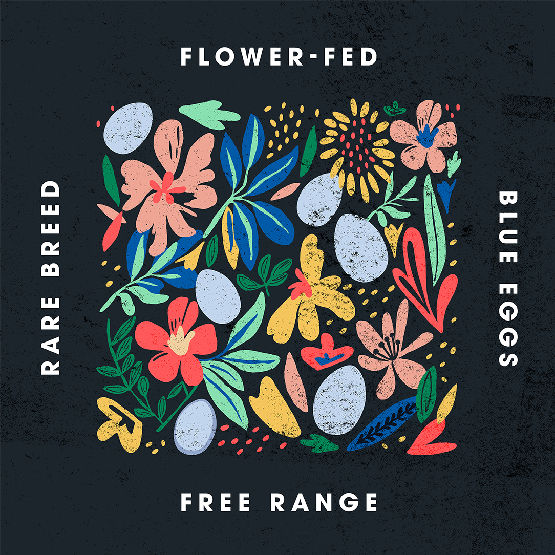
Fairburn’s weren’t just launching a new product. They were going after market share, with a bold aim to move from the UK’s 3rd to 2nd largest egg producer in six months. The British Blue® egg was the vehicle. The brand around it had to do a lot more than look good on shelf.

We helped Fairburn’s reposition their premium category to unlock long-term growth. Through joint strategy workshops, we built the brand architecture and identity that would define a new tier: high-quality, high-desire, and proudly different.
We found a powerful emotional space they could own: the special weekend breakfast. Elevated, indulgent, worth slowing down for.
We created Fairburn’s Famous, a new sub-brand with standout visual presence and a distinctive 4-egg pack format. From pack to product to positioning, every detail was crafted to challenge the category and connect with shoppers on a different level.
It didn’t just work on shelf, it won industry recognition too, picking up a Prolific North Design Award for best packaging.
What they asked for:
A packaging design for British Blue®
What they got:
A brand platform to unlock premium growth
A new sub-brand with category standout
A creative and commercial edge in every egg
Award-winning design that delivered on ambition

 Work
Work Contact